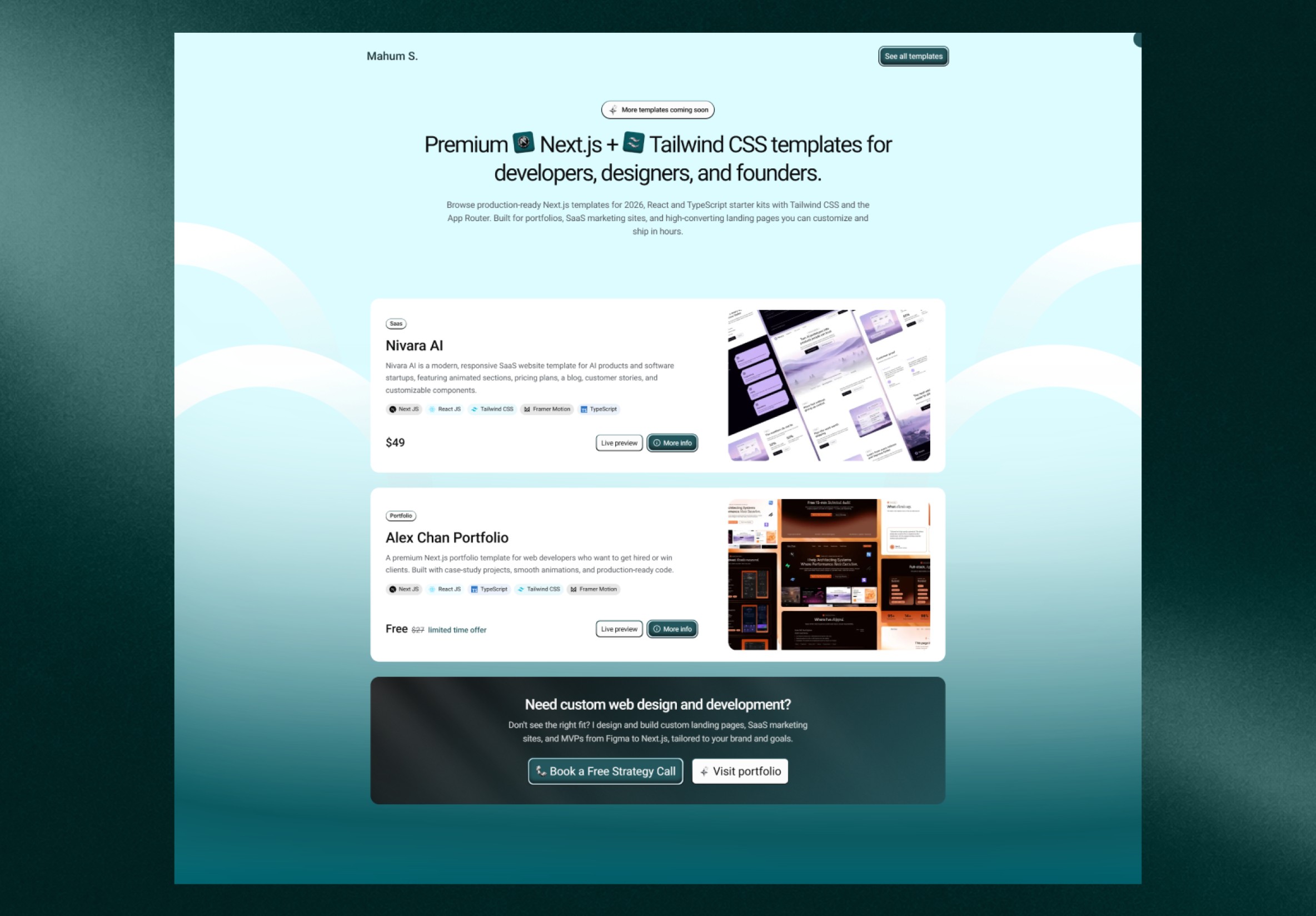
Strategy & structure
Brand-led page structure & visual direction
A studio website that gives the work room to speak, explains the offer clearly, and turns interest into a conversation.
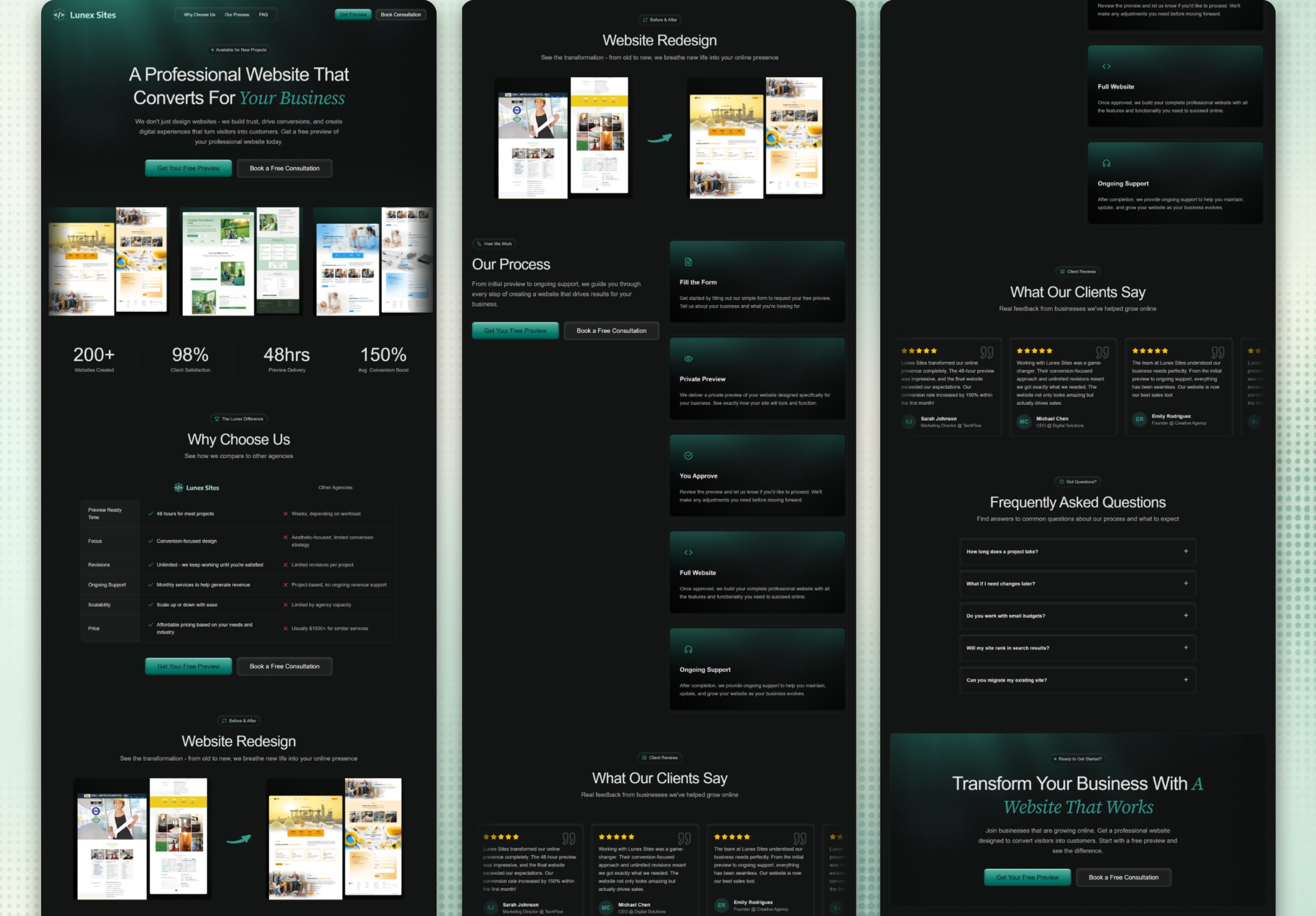
The studio needed a site that could show its range while helping prospective clients see which projects were relevant to them.
We organized the site around selected work, backed each example with context, and gave visitors a direct route from services to an enquiry.
Brand-led page structure & visual direction
Portfolio, services & enquiry journey
Responsive design & frontend development
Large previews establish the studio’s range, while short introductions tell readers what each project set out to achieve.
Consistent grids and restrained type let the images carry the character from one page to the next.
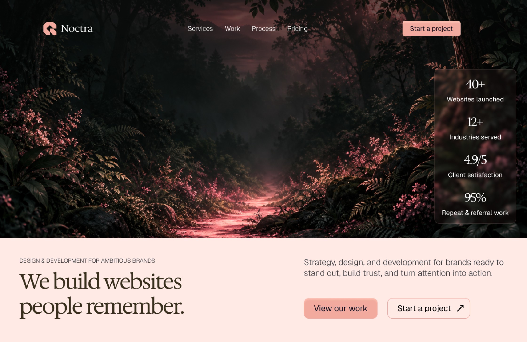
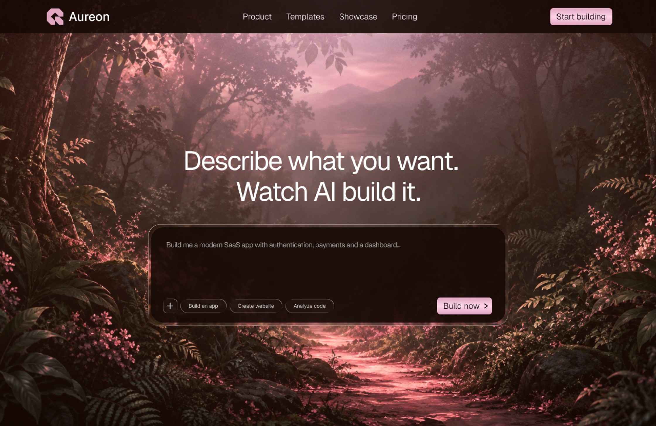
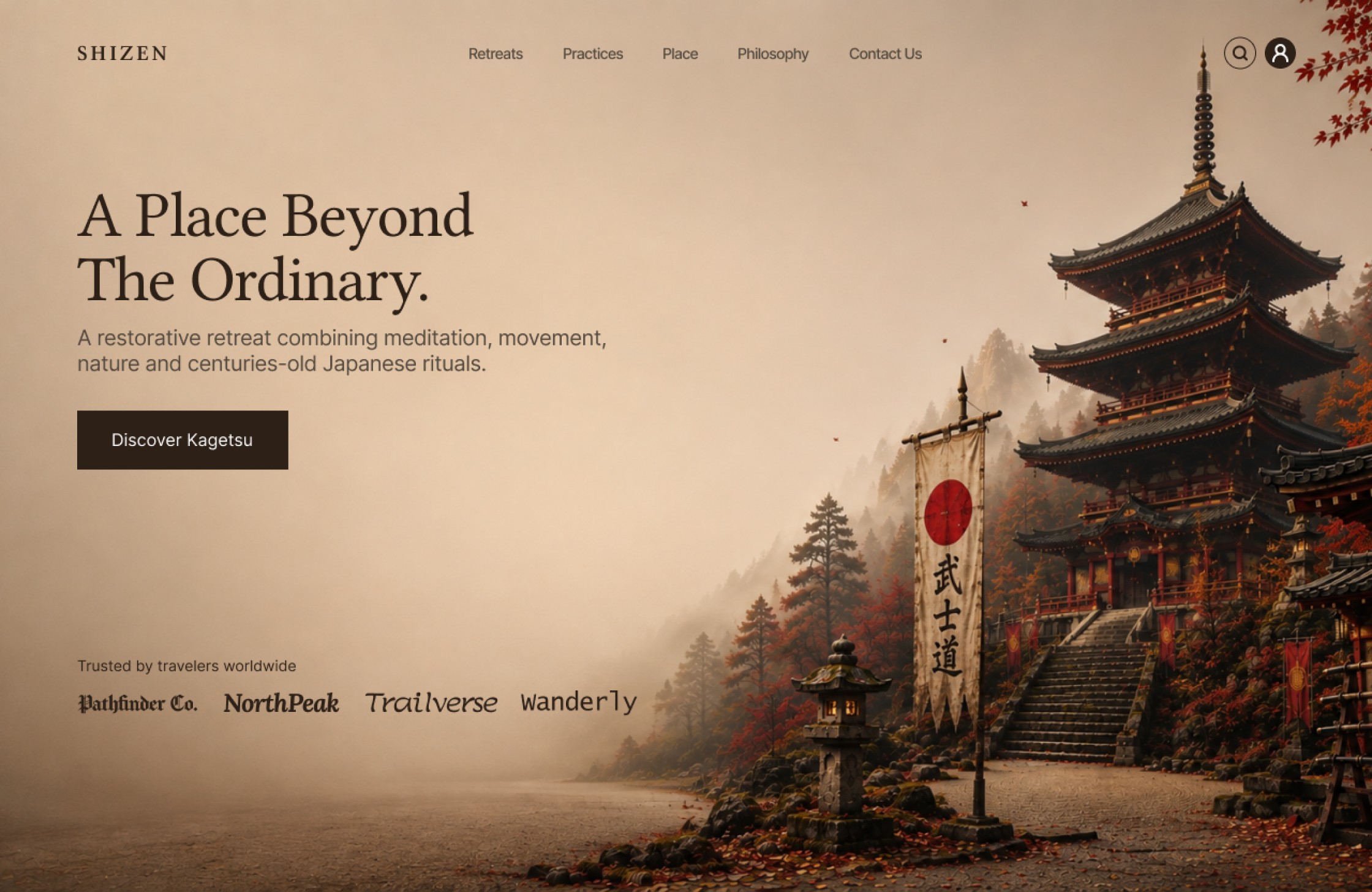
The portfolio uses repeatable sections so the studio can add work without redesigning the site.
Project cards, detail pages, and related work.
Service summaries paired with a direct contact path.
Image crops and typography tested across screen sizes.
Guidance on adding new projects and choosing suitable images.
The concept gives selected projects enough context to help prospective clients understand how the studio works.
The studio’s strengths come through in the work it chooses to feature.
Each example explains the brief and the studio’s contribution.
An enquiry is within reach from the services and work pages.
Illustrative case-study content for the Orlo template. No client results or performance metrics are claimed.
Tell us about your idea, your goals, and where you want to go. We’ll help you work out the next step.